
Jaafer Mnassri
Web Developer
Dark Mode Design Tips for Modern Websites
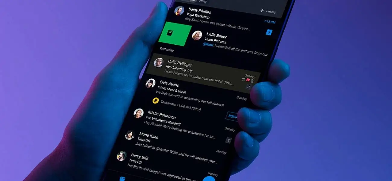
Dark mode is more than just a trend—it’s a user preference that enhances readability, reduces eye strain, and gives your website a sleek, modern look. As users demand more control over their digital experiences, supporting dark mode has become essential for designers and developers alike. Here’s how to design effectively for dark mode in 2025.
1. Use True Blacks Carefully
While pure black (#000000) can offer high contrast, it can also be harsh on the eyes. Instead, opt for deep grays (#121212 or #1A1A1A) to create a softer, more comfortable background that still delivers the dark mode feel.
2. Maintain Sufficient Contrast
Text should remain highly readable against dark backgrounds. Use off-white tones (like #E0E0E0) for body text and ensure that links and UI elements have distinct visual weight to maintain accessibility standards.
3. Avoid Pure White Highlights
Bright whites on dark backgrounds can create visual vibration and strain. Use muted highlights (#CCCCCC to #F0F0F0) to emphasize without overwhelming the viewer’s eyes.
4. Embrace Vibrant Accent Colors
Dark mode allows brighter accent colors to pop. Use vibrant blues, purples, or teals sparingly to draw attention to buttons, CTAs, or links without clashing with the dark aesthetic.
5. Optimize Images and Icons
Use SVGs or PNGs with transparent backgrounds to adapt to dark mode automatically. Icons may require a white or light-colored version to remain visible. Always test how media looks in both modes.
"Dark mode is about more than color—it’s about visual comfort, accessibility, and mood."
6. Support System Preferences
Use CSS media queries like prefers-color-scheme: dark to automatically adjust your website’s appearance based on the user's device setting. Provide a manual toggle for added flexibility.
7. Design for Both Modes
Don't treat dark mode as an afterthought. Design light and dark modes in parallel to ensure consistency in branding, usability, and experience. Tools like Figma and Sketch make this easier than ever.
8. Test Across Devices
Dark mode may render differently across operating systems and browsers. Test on mobile, desktop, and tablets to ensure your design is polished and functional everywhere.
Dark mode is here to stay. By designing with intention, contrast, and user preference in mind, you can create a visually appealing and accessible experience that feels modern and user-friendly in any context.